In 1993 when I was a kid, Tom Grindberg was a guest penciler for two issues of my favorite Marvel superhero series: Silver Surfer #84 and Spider-Man 2099 #14. I hated his artwork then because it was such a radical departure from the thin lines of Ron Lim and Rick Leonardi.
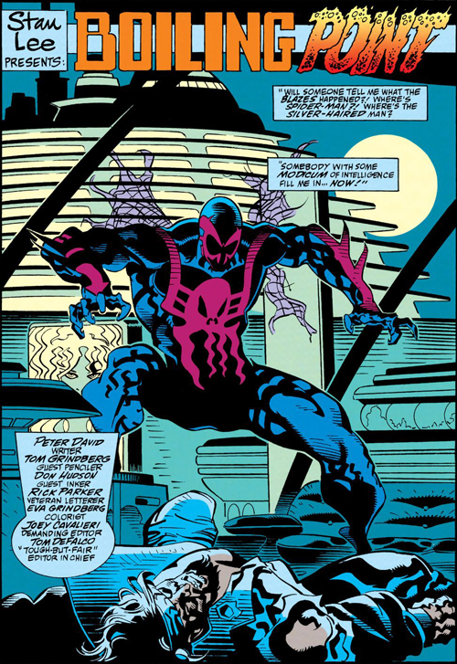
A splash page from Spider-Man #2099 #14. Artwork by Tom Grindberg, penciler; Don Hudson, inker; Eva Grindberg, colorist; and Rick Parker, letterer.
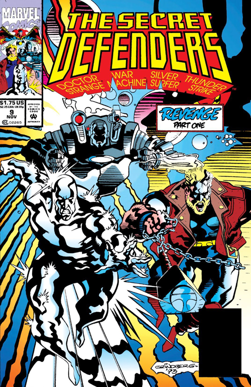
But now I love it! It’s amazingly ugly. His figures are impossibly bulky and stretch in weird, fluid ways. They just seem so big and imposing and in your face which is great for bruisers like Thanos, Thor, and Drax.
The cover of Secret Defenders #9. Artwork by Tom Grindberg, penciler; Don Hudson, inker; John Kalisz, colorist; and John Costanza, letterer.
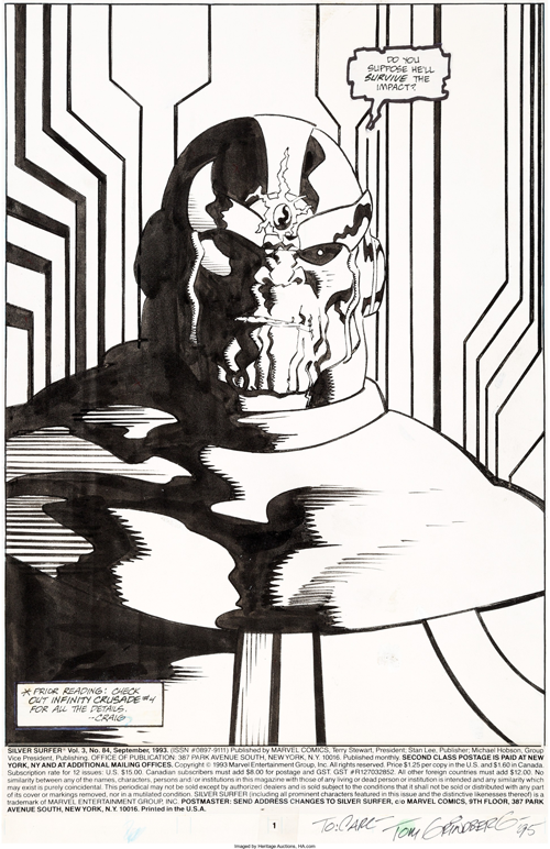
It looks weird for someone who’s usually more svelte like the Silver Surfer, Spider-Man, Dr Strange, or Adam Warlock, but I like weird.
The original art for a splash page from Silver Surfer #84. Artwork by Tom Grindberg, penciler; Tom Christopher, inker; and Ken Bruzenak, letterer.
Overall his renditions of characters look more alive than the stiff figures of more popular artists like Lim and Rob Liefeld. The thick, wavy black lines are out of this world. But what’s strange is that, as far as I can tell, Grindberg only drew this way in 1993 and the first half of 1994. By his next issues of Silver Surfer and Spider-Man 2099, #93 and #25 respectively, he’s much closer to early 90’s Marvel house style. And it didn’t matter whom his inker was – Don Hudson inked Spider-Man 2099 #14, Secret Defenders #9, and Grindberg’s short story in Spider-Man 2099 #25. Someone must have told him to rein it in, which is a bummer.

